Data Visualization
Data Carpentry contributors
Learning Objectives
- Create simple scatterplots, histograms, and boxplots from data in a data frame.
- Customize the aesthetics of an existing plot.
- Export plots from RStudio to standard graphical file formats.
Plots in R
The mathematician Richard Hamming once said, “The purpose of computing is insight, not numbers”, and the best way to develop insight is often to visualize data. Visualization deserves an entire lecture (or course) of its own, but we can explore a few features of R’s plotting packages.
When we are working with large sets of numbers it can be useful to display that information graphically. R has a number of built-in tools for basic graph types such as hisotgrams, scatter plots, bar charts, boxplots and much more. We’ll test a few of these out here on the genome_size vector from our metadata.
Plotting with ggplot2
ggplot2 is a plotting package for R that’s designed specially for data stored in data frames. The syntax takes some getting used to but it’s extremely powerful and flexible.
We will will work with the metadata data frame for the following figures. Let’s start by loading the ggplot2 library.
#install.packages("ggplot2")

library(ggplot2)
The ggplot() function is used to initialize the basic graph structure, then we add to it. The basic idea is that you specify different “layers” of the plot, and add them together using the + operator.
We will start with a blank plot and will add layers as we go along.
ggplot(metadata)Geometric objects are the actual marks we put on a plot. Examples include:
- points (
geom_point, for scatter plots, dot plots, etc) - lines (
geom_line, for time series, trend lines, etc) - boxplot (
geom_boxplot, for, well, boxplots!)
A plot must have at least one geom; there is no upper limit. You can add a geom to a plot using the + operator
ggplot(metadata) +
  geom_point() # note what happens here
This gives us an error because geom_point requires some extra information in order to know what to plot. have to tell it what to put on the x and y axes. Let’s start by plotting genome size for each sample.
ggplot(metadata) +
  geom_point(aes(x = sample, y = genome_size))
Each type of geom usually has a required set of aesthetics to be set. Check the help pages for each geom to see what aesthetics it accepts. Examples include:
- position (i.e., on the x and y axes)
- color (“outside” color)
- fill (“inside” color)
- shape (of points)
- linetype
- size
Aesthetic mappings are set with the aes() function - this maps values in the dataset to aesthetics in the data. We can also set plotting parameters globally outside of the aes() function. For example, this code will map point colour to the “cit” column:
ggplot(metadata) +
  geom_point(aes(x = sample, y = genome_size, colour = cit))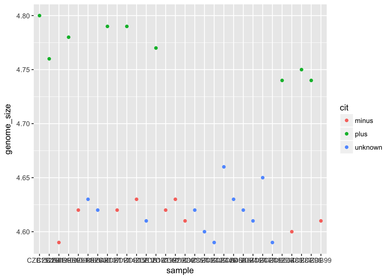
In contrast, this code sets the colour of all the points to red:
ggplot(metadata) +
  geom_point(aes(x = sample, y = genome_size), colour = "red")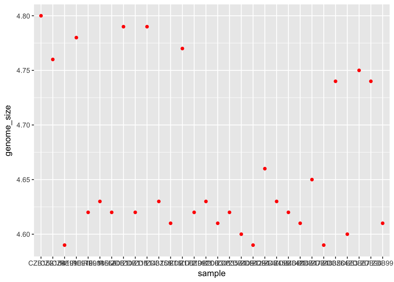
Challenge
Make a plot where the colour of the points is mapped to the “clade” column.
Solution
ggplot(metadata) +
  geom_point(aes(x = sample, y = genome_size, colour = clade))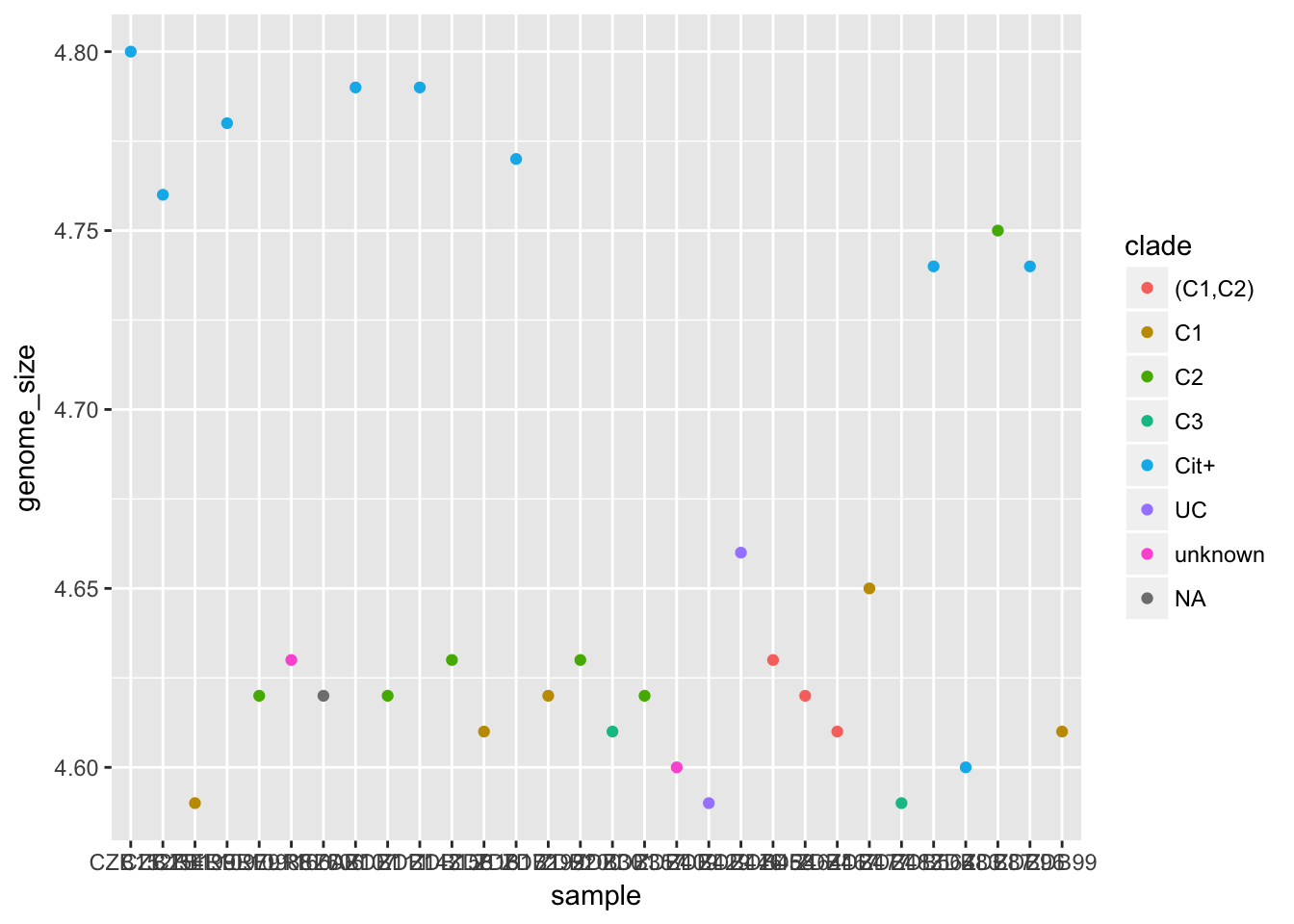
Challenge
Look at the help for the
pointsfunction (?points) to find all the possible points shape in R. Make a plot where all the points are triangle shapes.
Solution
ggplot(metadata) +
  geom_point(aes(x = sample, y = genome_size), shape = 17) # for example; also 2, 6, 24, 25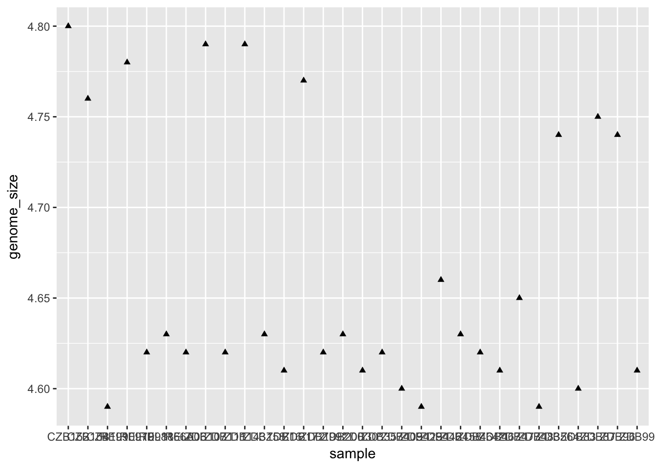
Customising plot appearance
The labels on the x-axis are quite hard to read. To modify this we need to add an additional “theme” layer. The ggplot2 theme system handles non-data plot elements such as:
- Axis labels
- Plot background
- Facet label backround
- Legend appearance
There are built-in themes we can use, or we can adjust specific elements. For our figure we will change the x-axis labels to be plotted on a 45 degree angle with a small horizontal shift to avoid overlap.
ggplot(metadata) +
  geom_point(aes(x = sample, y = genome_size)) +
  theme(axis.text.x = element_text(angle=45, hjust=1))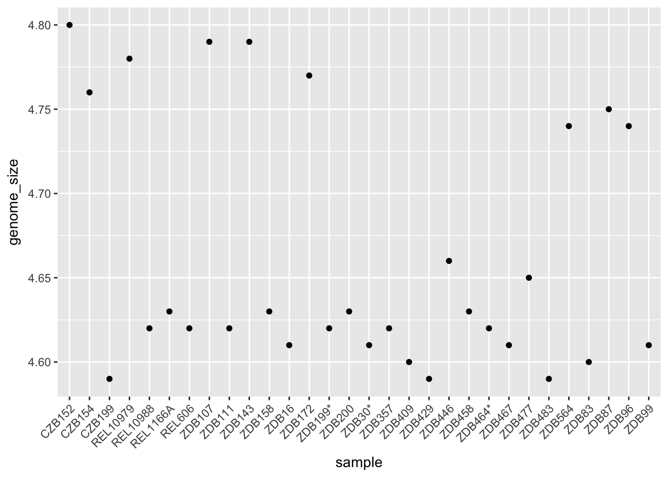
Other types of plots
Histograms
To plot a histogram we require another geom, geom_histogram.
ggplot(metadata) +
  geom_histogram(aes(x = genome_size))
## `stat_bin()` using `bins = 30`. Pick better value with `binwidth`.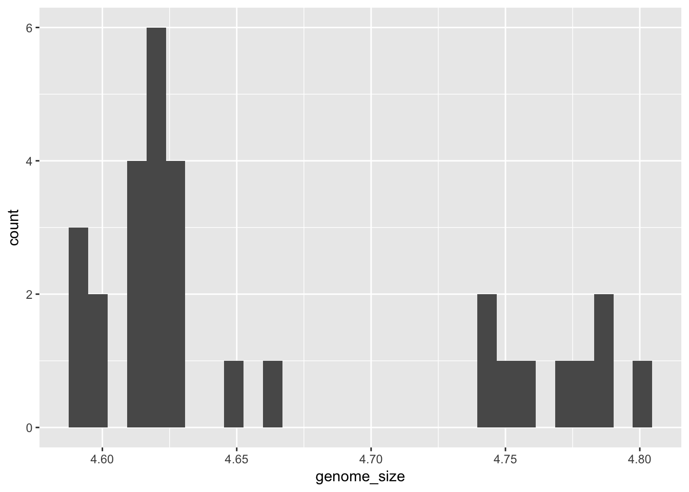 While
While geom_point plots the data exactly as it is, geom_histogram is summarising the data by binning it. We can change how this summarisation is done by changing the “binwidth” parameter.
ggplot(metadata) +
  geom_histogram(aes(x = genome_size), binwidth=0.05)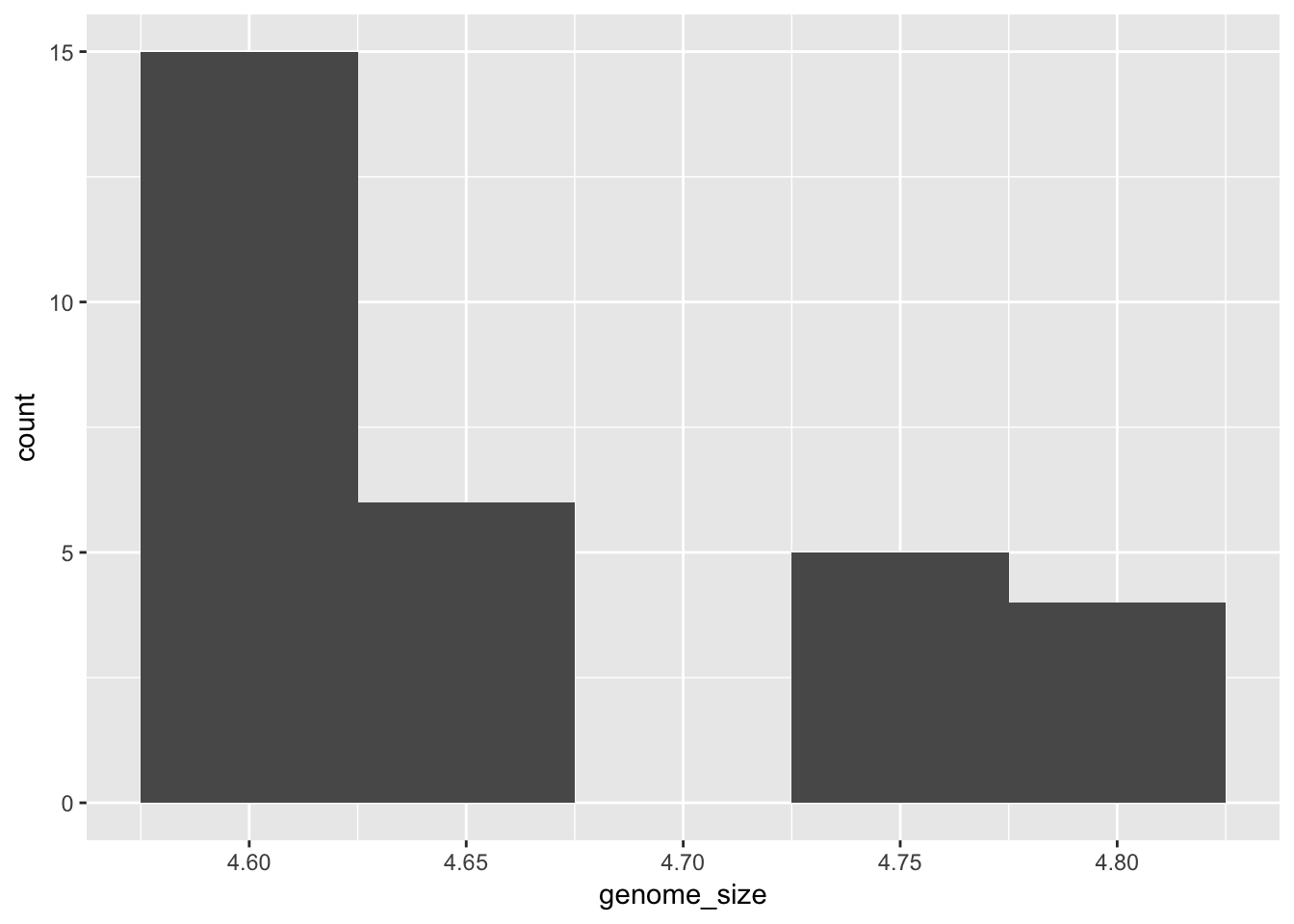
Challenge
Change the fill colour of the histogram.
Solution
ggplot(metadata) +
  geom_histogram(aes(x = genome_size), binwidth=0.05, fill = "darkblue")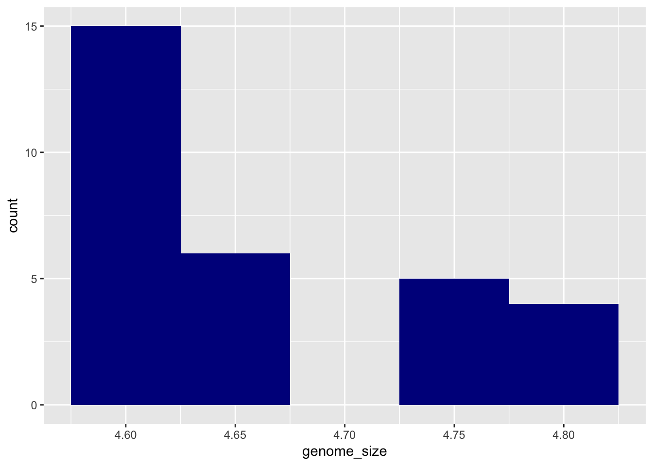
Boxplots
There is also a geom for plotting boxplots, geom_boxplot. A boxplot provides a graphical view of the median, quartiles, maximum, and minimum of a data set. We can use a boxplot to compare genome sizes between strains with a different citrate mutant status.
Now that we have all the required information on let’s try plotting a boxplot similar to what we had done using the base plot functions at the start of this lesson. We can add some additional layers to include a plot title and change the axis labels. Explore the code below and all the different layers that we have added to understand what each layer contributes to the final graphic.
ggplot(metadata) +
  geom_boxplot(aes(x = cit, y = genome_size, fill = cit))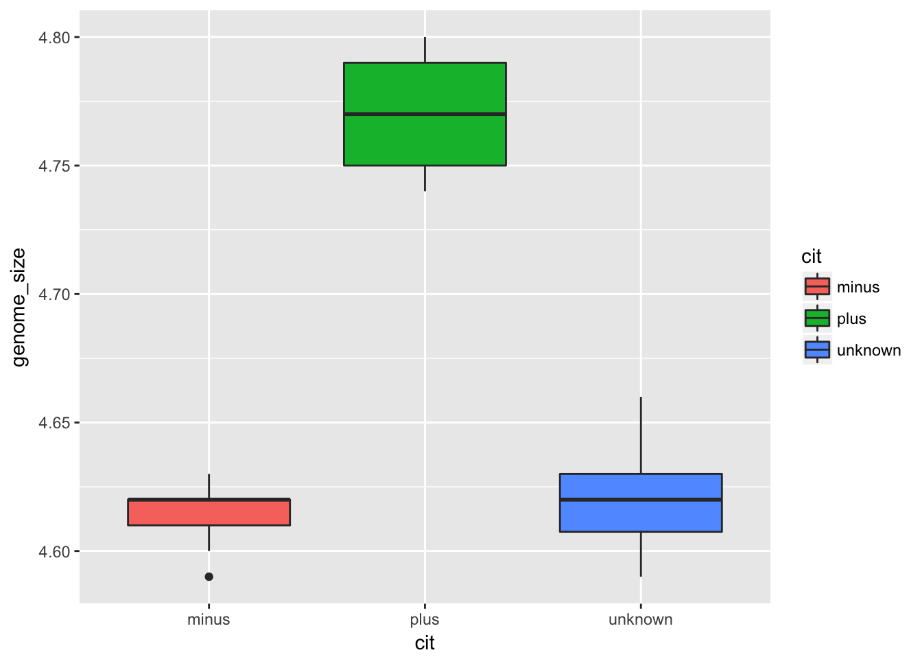
To make figures suitable for a publication or presentation, we should add better axis labels and a title for the plot. These are added in the same way as other plot layers.
ggplot(metadata) +
  geom_boxplot(aes(x = cit, y = genome_size, fill = cit)) +
  ggtitle('Boxplot of genome size by citrate mutant type') +
  xlab('Citrate mutant type') +
  ylab('Genome size (Mb)')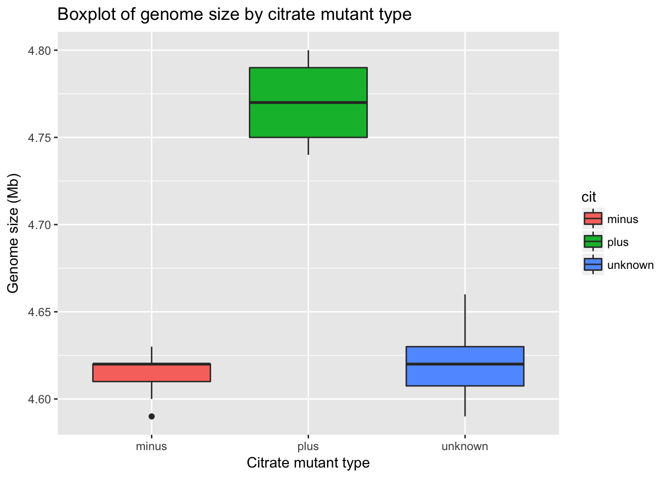
Writing figures to file
There are two ways in which figures and plots can be output to a file (rather than simply displaying on screen). The first (and easiest) is to export directly from the RStudio ‘Plots’ panel, by clicking on Export when the image is plotted. This will give you the option of png or pdf and selecting the directory to which you wish to save it to.
The second option is to use R functions in the console, allowing you the flexibility to specify parameters to dictate the size and resolution of the output image. Some of the more popular formats include pdf(), png(), which are functions that initialize a plot that will be written directly to a file in the pdf or png format, respectively. Within the function you will need to specify a name for your image in quotes and the width and height. Specifying the width and height is optional, but can be very useful if you are using the figure in a paper or presentation and need it to have a particular resolution. Note that the default units for image dimensions are either pixels (for png) or inches (for pdf). To save a plot to a file you need to:
- Initialize the plot using the function that corresponds to the type of file you want to make:
pdf("filename") - Write the code that makes the plot.
- Close the connection to the new file (with your plot) using
dev.off().
pdf("figure/boxplot.pdf")

ggplot(metadata) +
  geom_boxplot(aes(x = cit, y = genome_size, fill = cit)) +
  ggtitle('Boxplot of genome size by citrate mutant type') +
  xlab('Citrate mutant type') +
  ylab('Genome size (Mb)')

dev.off()
Resources:
We have only scratched the surface here. To learn more, see the ggplot2 reference site, and Winston Chang’s excellent Cookbook for R site. Though slightly out of date, ggplot2: Elegant Graphics for Data Anaysis is still the definative book on this subject. Much of the material here was adpapted from Introduction to R graphics with ggplot2 Tutorial at IQSS.
Data Carpentry,
2017. License. Contributing.
Questions? Feedback?
Please file
an issue on GitHub.
On
Twitter: @datacarpentry